CSS Basics
- CSS Basics
Introduction to CSS
- CSS is used to style an HTML page and the corresponding elements
- CSS file has 2 parts:
- Selector
- Declaration Block
- Declarations are made in property / value pairs where the property selects the type and the value changes the value
- A CSS rule set has a selector part and a declaration
- Ex.
p {
font-size: 20px;
}
- Ex.
- Can select more than one tag at a time
For classes use "." before name
- Ex. ``` .my-class {
} ```
For Id us "#" before name
- Ex. ``` #my-id {
} ```
Adding CSS to HTML page
- CSS can be added to an HTML page in 3 ways:
- Using the
<link>tag- Adds an external CSS file rules to the HTML page
- Ex.
<link rel="stylesheet" type="text/css" href="myfile.css">
- Using the
<style>tag- Allow for adding some custom CSS tags to an HTML file
- Ex.
<style>
    CSS Rules
</style>
- Inline styles
- Can add specific inline styling to specific HTML elements
- Ex.
<div style="background-color: yellow">...</div>
- Using the
Selectors
- Selectors is the idea of selecting elements in the HTML tree to target for the CSS declaration rules
- Selectors can range from very basic to very specific
Basic Selectors
- Basic selectors entail selecting a single HTML element either by tag, class name, or id
- Ex. To target
<p>elements,p { font-size: 20px; } - The same works for classes and Id
- Class
.class-name { rules... } - Ids
#id-name {
rules...
}
Combining Selectors
- Can target an element by class-name or id
Ex.
    <p class="dog-name>
        Roger
    </p>
    ...
    p.dog-name {
        rules...
    }
For targetting multiple classes, combine the class-names in the selector without spaces
Ex.
.dog-name.roger {
rules...
}
Grouping Selectors
- Can combine selectors so that the rules apply to multiple elements by having a comma in between
- Ex.
p, .dog-name {
color: yellow;
}
Selectors by following Document Tree Structure
- Use spaces in between to target children of a targeted element
- Ex.
p span { color: yellow; } - This targets span elements that are children of p elements
Cascade
- Cascading is an important topic within the realm of CSS in styling HTML pages
- There is a certain order and priority that gets applied for rules because sometimes there can be conflicting rules
- What it considers in the algorithm to figure the cascading are:
- specificity
- importance
- inheritance
- order in the file
Specificity
- Specificity is determined by a system where the more specific rule will win
- If two rules have the same specificity, the one that appears later in the file wins
Specificity Calculation
- Specificity is calculated by utilizing a 4 number system
- There are 4 slots and all of them starts at 0
- 0 0 0 0
- The slot at the leftmost is the most important and the rightmost is the least important
- Ex. 1 0 0 0 is higher specificity than 0 1 0 0
- Slot 1:
- Slot 1 is incremented when there is an element selector
- Ex.
p {}                    /* 0 0 0 1 */
span {}                 /* 0 0 0 1 */
p span {}               /* 0 0 0 2 */
p > span {}             /* 0 0 0 2 */
div p > span {}         /* 0 0 0 3 */
- Slot 2:
- Slot 2 is incremented by:
- class selectors
- pseudo-class selectors
- attribute selectors
- Ex.
.name {}                /* 0 0 1 0 */
.users .name {}         /* 0 0 2 0 */
[href$='.pdf'] {}       /* 0 0 1 0 */
:hover {}               /* 0 0 1 0 */
- Slot 2 is incremented by:
- Slot 3:
- Slot 3 is incremented by id selectors
- Ex.
#name {}                    /* 0 1 0 0 */
.user #name {}              /* 0 1 1 0 */
#name span {}               /* 0 1 0 1 */
Slot 4:
- Slot 4 is incremented by inline styling
- Inline styling will have the most precedence over any rule
- Ex.
<p style="color: red">Test</p> /* 1 0 0 0 */
!important can be used to override any styling precedence
Ex.
p {
font-size: 20px!important;
}
By making this rule, this will take precendence over any CSS rule except for those that also have !important, which in that case will resolve using the specificity rules above
Generally its better to not utilize id rules and !important as this can create issues if multiple CSS files are utilized in one HTML page
Rather, more specific rules should be creating by combining selectors
!important should only be utilized to see some kind of effect when testing
Inheritance
- Some CSS properties inherit from parent to child without having to explicitly state the rule in the child while others don't
- For example, "font-family" gets inherited from the parent to child by default but "background-color" does not get inherited from parent to child
- To force properties to inherit, create a property rule in the parent and then have "inherit" as the value in the child
- Ex.
body { background-color: yellow; } p { background-color: inherit; } - There are also methods to prevent inheriting in the children or reverting
Attribute Selectors
- There are also ways to specify selectors to target HTML elements by their attributes
- It is possible to target a certain element tag with a id attribute utilizing the "[]" syntax
- Ex.
p[id] { rules... } - This will select all
<p>elements that have an "id" attribute regardless of value - Attribute selectors can also be matching to some regex pattern or exact
- Ex.
p[id="my-id] { rules... } - In this case the CSS will only apply when the element is a
<p>tag and the id attribute matches that string
Pseudo Classes
- Pseudo classes are predefined keywords that are used to select elements based on their state or to target a specific child
- One of the most popular ones that are used is ":hover"
- This targets an element if it is hovered over
- Ex. When links are clicked, they switch state to ":active" and ":visited"
a, a:visited, a:active { color: yellow; } - Can write the CSS selector utilizing pseudo-classes to make sure that the CSS stays regardless of the element's state
- :nth-child() is another option as it allows for targeting odd and even children
- Often utilized to style lists such that the style is different for adjacent children
Pseudo Elements
- Used to style a specific part of an element
- Syntax starts with "::"
- The most common one are "before" and "after" which allow you to add content before or after an element
- Most commonly used for adding things like icons
- Must specify the content property before inserting
- Ex. ``` p::before { content: url(/myimage.png); }
.myElement::before { content: "Hey Hey!"; } ```
Colors
- Colors can be added to HTML elements through:
- color
- background-color
- border-color
- There are different ways to set colors:
- Named colors - Something like "blue" that CSS has predefined to work when trying to set the color
- RGB / RGBA - allows you to pick the rgb and alpha value
- These values go from 0 - 255
- Ex. rgb(0, 0, 0) will be black
- The rgba() allows you to add transparency through the last channel
- Hexadecimal Notation - in the form of "#ffffff" or "#fff"
- Express the numbers in 3 two digit numbers which range from 0 - 15 (0 - f)
- Can also add two extra digits for the alpha channel at the end
- HSL / HSLA - For hue, saturation, and lightness
- This is the same as RGB / RGBA but it is just in another format
Units
- Units are standardized definitions in CSS that allow to easily set lengths, paddings, margins, etc.
Pixels
- Pixels are the most widely utilized measurement unit
- It doesn't exactly correspond to 1 exact pixel because of the difference in retinas of devices, but allows for a easy, standardized measurement
- Ex.
p {
margin-top: 20px;
}
Percentages
- Percentages allow you to define properties based on the parent's value
.parent {
width: 400px
}
.child {
width: 50%; /* = 200px */
}
Relative Units
- Commonly used are relative units that are relative to a font-size
- "em" is the value assigned to that element's font-size
- "rem" is the same as "em" but it measures the root element's font-size
- Allows for consistency across the entire document
Viewport Units
- "vw" is the viewport width which takes a percentage of the viewport width
- Ex. 50vw means 50% of the viewport width
- "vh" is the viewport height which takes a percentage of the viewport height
- "vmin" is the viewport minimum that represents the minimum between the height and width in terms of percentage
- Ex. 30vmin is the 30% of the current width or height, whatever is smaller
- "vmax" is the same as "vmin" just maximum
- Viewport units are not inherited, meaning to set the height based on a viewport percentage, the parent's height does not need to be specified
Fraction Units
- "fr" are fraction units that are utilized in CSS Grids to divide space into fractions
URL()
- URLs are used to load resources such as images, gifs, mp4s, sound, etc.
- Ex.
div { background-image: url(test.png); } - The url provided can be a relative URL, external absolute URL, or can find from the root of the domain of the CSS
Calc()
- calc() function allows for performing basic math operations on values
- Especially useful for adding or subtracting a length from a percentage
- Ex.
div {
max-width: calc(80% - 100px)
}
- Returns a "length" value so it can be used anywhere that expects a pixel value
- Ex.
Width of element defined using the calc() function
Backgrounds
- Backgrounds of elements can be set with numerous properties
- Most popular are:
- background-color
- background-image
- background-attachment
- background-size
- background-repeat
- Ex.
Background example with linear gradient
Comments
- For commenting in CSS, only block comments are allowed
- The syntax is
/*...*/ - Helps since this allowed you to comment out multiple lines until
*/is reached - CSS doesn't have inline comments so only block comments can be used
More CSS
- More CSS
Box Model
- In HTML and CSS, every element is essentially a box
- The box model explains how elements are presented and manipulated in CSS
- There are 4 areas in the CSS box model
- From inside to outside
- Content Area
- Padding Area
- Border Area
- Margin Area
- Ex.
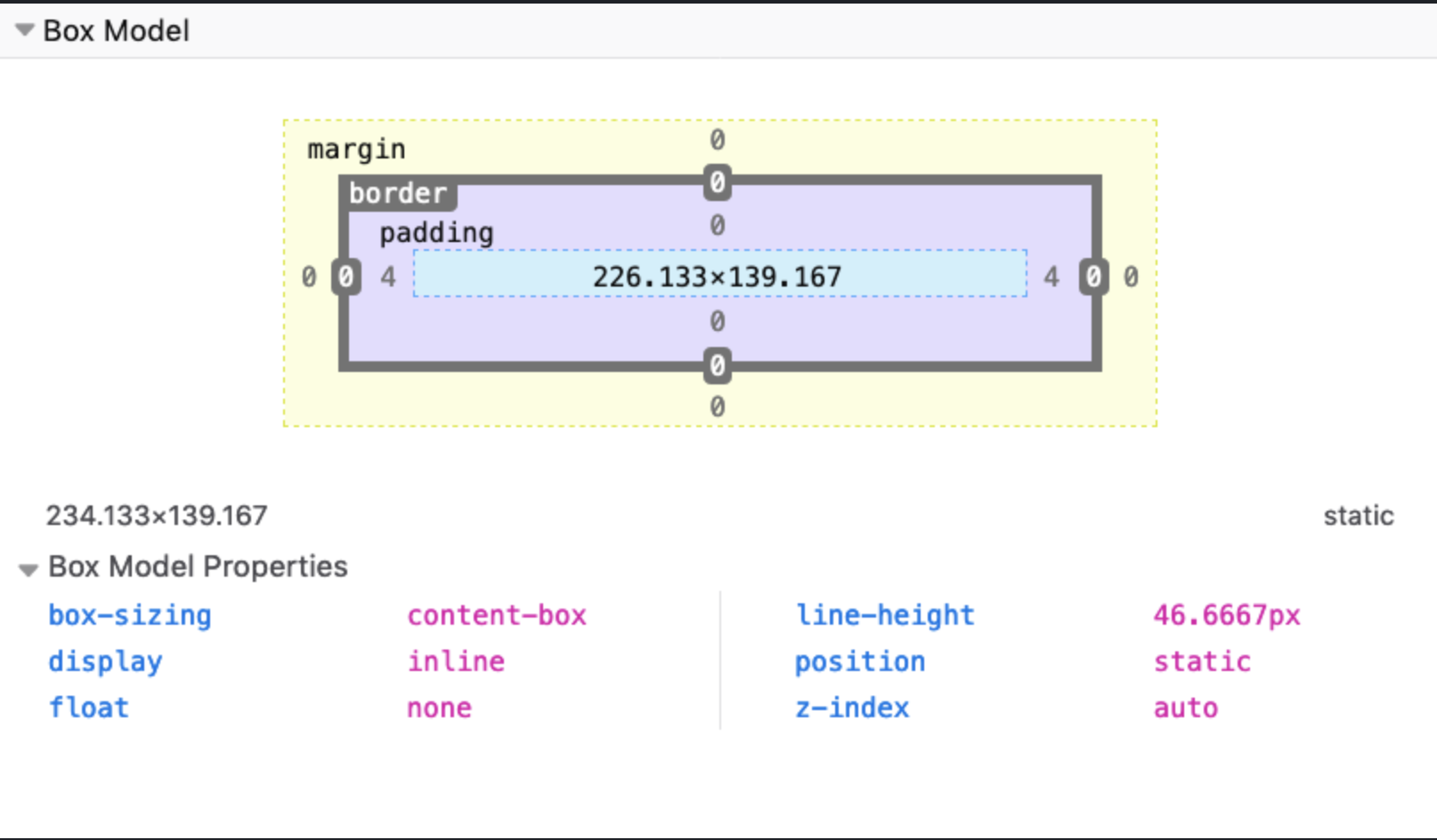
- Setting width or height sets the content area not the padding, border, or margin areas
Border
- The border is the thin area between the padding and margin
- Essentially, editing this area allows for editing the perimeter of the element
- Can work on borders using these properties:
- border-style
- border-color
- border-width
- border-radius
- Can set images for borders with border-image
Border-style
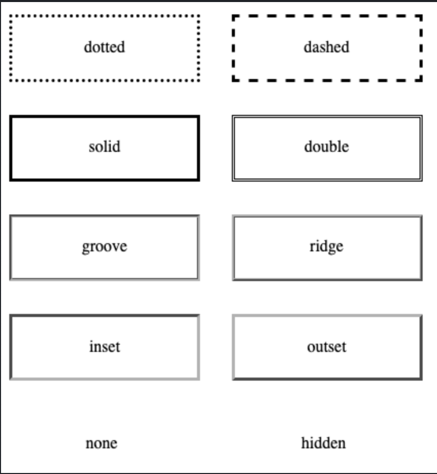
- border-style property allows for picking the style of border
- Ex.
- dotted
- dashed
- solid
- double
- Ex.
Border-width
- border-width allows for specifying the width of hte lines of the border
- word values are:
- thin
- medium
- thick
- length values using "em" or "px" can also be used
- word values are:
Border-color
- border-color is utilized to set the color of the border
- Default color is the element's text color
Border-radius
- border-radius is used to set rounded corners in the border
Value that is passed is the radius of the circle on the corners used to round the border
Ex.
Border example with border-radius, border-width, border style, and border-color
Margin
- A CSS property that is used to add space around an element
- Margin adds space outside an element border
- Padding on the other hand adds space inside an element border
- Margin have 4 properties that can be specified:
- margin-top
- margin-right
- margin-bottom
- margin-left
- margin is typically utilized to add small amounts of spacing or for centering elements by using "auto"
- Ex.
.class {
margin: 0 auto
}
- Ex.
- This makes the top and bottom margin 0 px while letting the browser automatically decide the spacing of the left and right margins for the element
- Ex.
Some Test for margin centering using "auto"
- Margin is also allowed to have negative values on the properties which makes it extend the opposite way
Padding
- Padding is the same as margin except that it adds space to the area inside the element border
- Margin adds space outside the element border
- Padding adds space inside the element border
- Similar to margin, it has 4 properties:
- padding-top
- padding-right
- padding-bottom
- padding-left
- Ex.
Some text to demonstrate padding
Box Sizing
- By default, the browsers calculate width and height of an element before the padding, border, and margin
- It gets complicated so there is a "box-sizing" property that allows for 2 property values:
- border-box
- content-box
- "border-box" changes the box-sizing such that the width and height calculation include the padding and the border
- Recommended to "reset" the CSS for every element to this setting since it is more intuitive
- Ex.
*, *::before, *::after {
box-sizing: border-box;
}
- Ex.
- Ex.
Example testing out "border-box"
Display
- "Display" property determines how the element is displayed by the browser
- 3 types of display elements (excluding "grid", "flex", "table")
- block
- inline
- none
Inline
- With "inline" as the property value, the elements don't have any margin or padding applied as well as height and width
- It appears "inline" with the elements that precede and come after it
Block
- Some elements are automatically set as "block" elements by the browser
- Block elements are those that take up 100% of the width of the screen
- They also stack on top of each other when placed one after another
- The width and height properties are actually utilized and can also set the margin and padding
None
- Display "none" hides the visibility of the element on the page
- The element will still be in the HTML code, but will not be rendered by the browser
Positioning
- Property that determines where elements appear on the screen and how they appear
- Can have 5 values:
- static
- relative
- absolute
- fixed
- sticky
Static
- This is the default setting that follows the normal page structure created from and HTML document
Relative
- Allows for positioning using 4 properties:
- top
- left
- right
- bottom
- Called offset properties tha accept a length as value
- Position relative allows for positioning the element relative to the parent element that is containing it
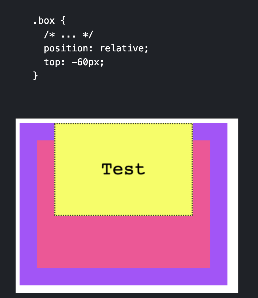
- Here we can see that the .box class (yellow) can be specified its position relative to the parent container which is the pink box
Absolute
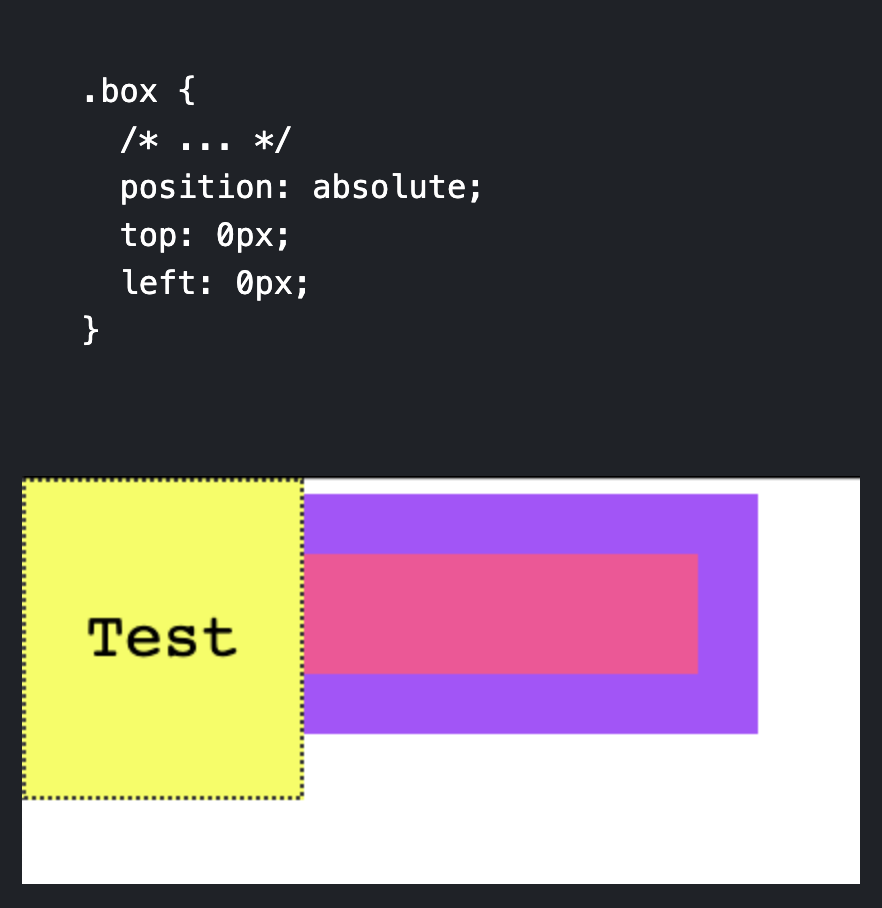
- Position absolute takes the element outside of the normal HTML flow and allows for manual positioning
- Only the (x, y) starting point is preserved
- The starting point is the starting point of the closest container that is not static
Fixed
- Position fixed is the same as position absolute except that the starting coordinates (x, y) are always positioned relative to the window instead of the first non-static container
- Also fixed elements are not affected by scrolling, they will remain on the page even if scrolling occurs
Sticky
- Position sticky is the same as fixed except that it stays at the top of the screen when the screen's scrolling has reached that element's scrolling point
- This means that it will act like static until its scrolling point is reached and then act like fixed at the top of the screen if the user keeps scrolling
Floating
- Floating allows you to remove an element from the normal page flow and used to be the old way to create "modern" layouts
- Kind of not utilized as much because of "Grid" and "Flexbox"
- Supports 3 values:
- left
- right
- none (default)
- Normally, the browser renders things like imgs and spans inline together one after another, meaning imgs will show in the middle of the text or not formatted
- Can be fixed with floats
- Ex.
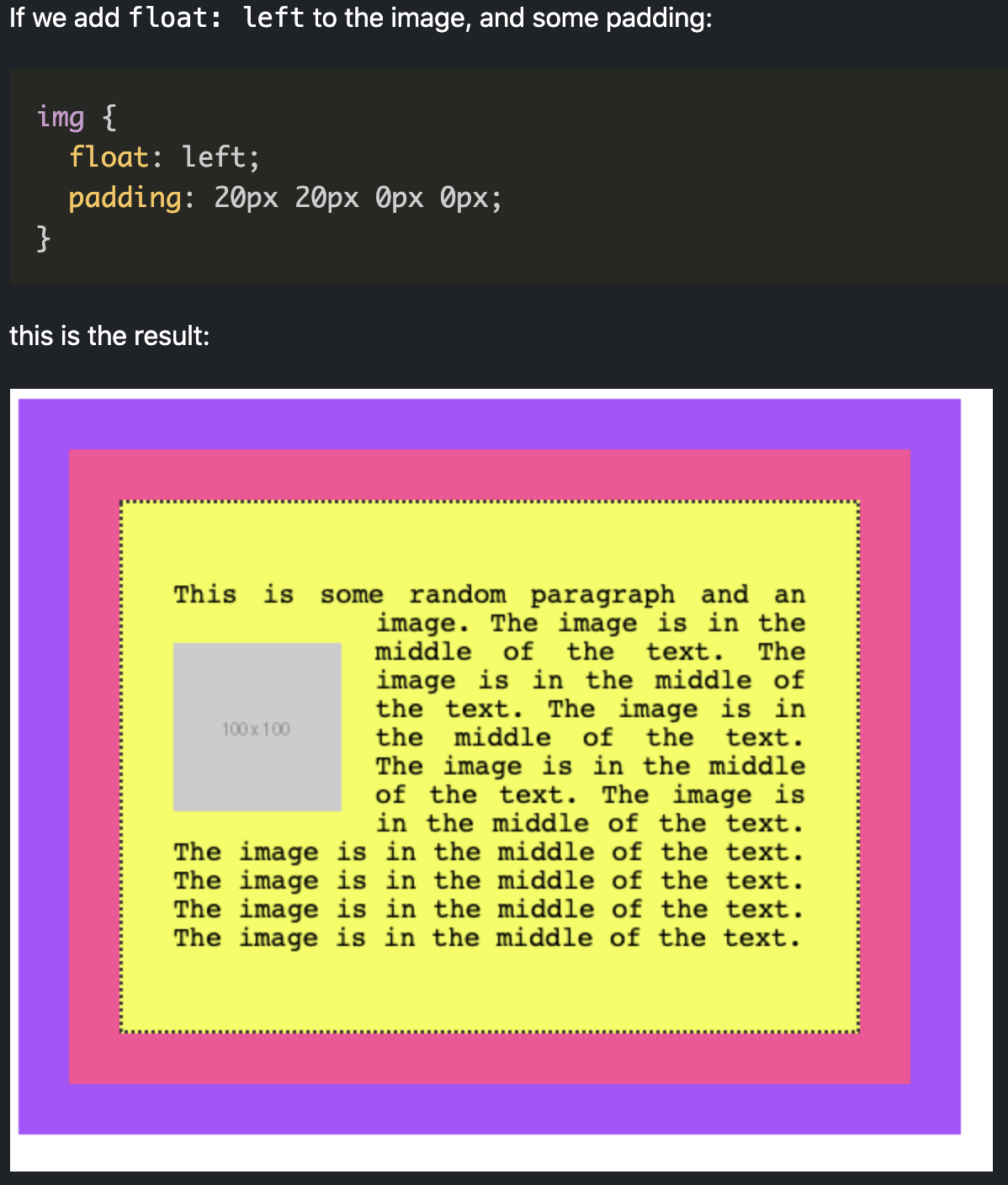
- Floated elements are removed from the normal flow of the page and the content flows around it
Clearing
- Floating multiple elements will make them just stack next to each other horizontally
- If space runs out at it will start a new line
- There is a property called "clear" that remedy's this and allows for horizontally floated elements to be stacked vertically
- Ex.
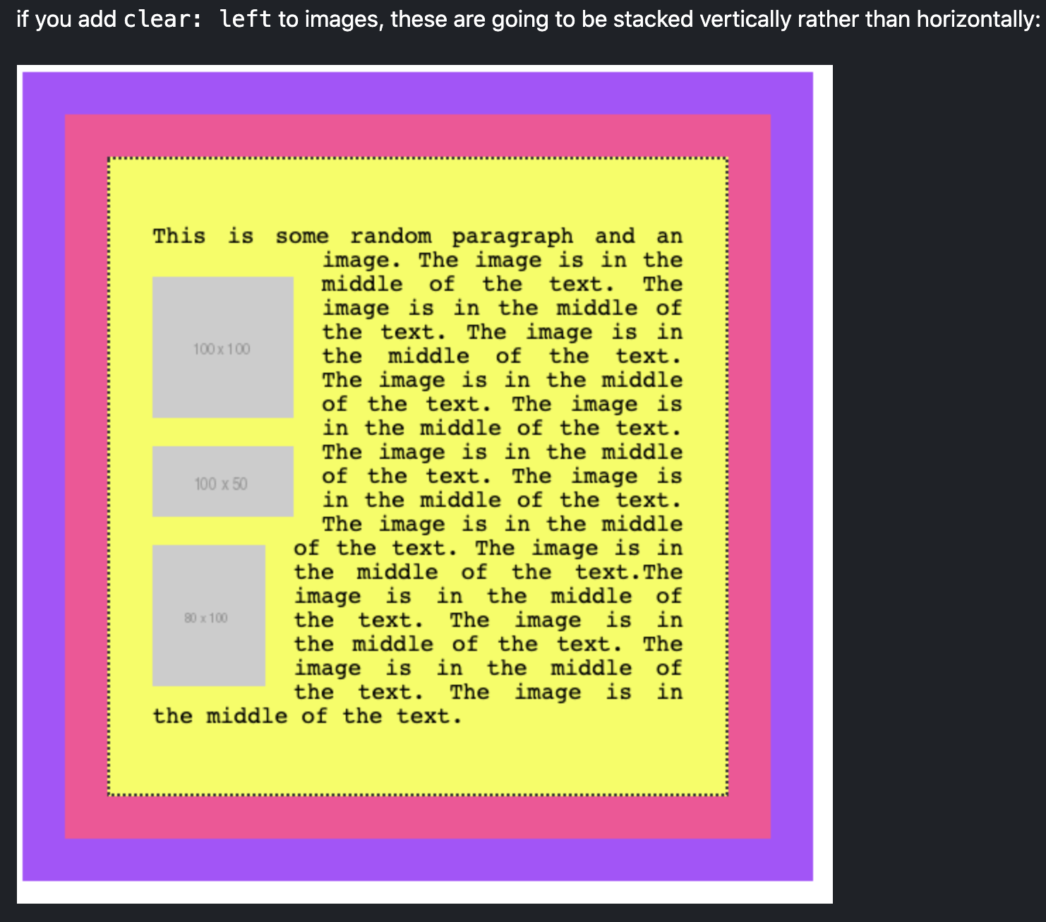
- For clearing use:
- "left" to clear left floats
- "right" to clear right floats
- "both" to clear both left and right flaots
- "none" (default)
Tables
- Tables used to be heavily utilized to create fancy page layouts but are not really utilized except for creating tables because of "grid" and "flexbox"
- Can easily style every other row to have a different color utilizing :nth_child(odd) or :nth_child(even) selector
- Ex.
| Name | Age |
|---|---|
| Flavio | 36 |
| Roger | 7 |
| Syd | 10 |
Centering
- Centering is normally a confusing thing without the aid of CSS grid and Flexbox
- For centering horizontally:
- For text:
- Just set "text-align" to center which automatically centers all text
- Ex.
p {
text-align: center
}
- For block elements:
- Set the width of the element and then set margin to "0 auto"
- Ex.
div {
width: 50%;
margin: 0 auto;
}
- For text:
Lists
- Lists can be styled by CSS using the following properties:
- list-style-type
- list-style-image
- list-style-position
list-style-type
- "list-style-type" is used to set a predefined marker such as:
- "square"
- "disc"
- "circle"
list-style-image
- "list-style-image" can be used to bring in a custom image marker
list-style-position
- "list-style-position" lets you add a marker inside or outside (default) the list content
This brinsg the marker in the flow of the page instead of outside of it
Ex. Using the list-style-type = circle and list-style-posion = inside
- item
- item
- item
- item
Filters
- Filters allow for "photoshop" like operations onto the elements
- Normally in photoshop it gets applied to only images, but it can be applied to any element
- The different filter values are:
- blur()
- opacity()
- grayscale()
- sepia()
- invert()
- brightness()
- saturate()
Blur
- Bluring merges the pixels together to blur what gets rendered
- Pass in a length value that specifies the blur radius
- Ex.

Opacity
- Takes a value from 0 - 1 or percentage that determines the image transparency
- There is an "opacity" property, but setting opacity in this manner is better because some implementations are hardware accelerated
- Ex.

Grayscale
- Takes a value from 0 - 1 or 0% - 100% which determines how gray the element becomes
- Ex.

Sepia
- Takes a value from 0 - 1 or 0% - 100% which determines how much of the sepia filter gets added
- Ex.

Invert
- Takes a value from 0 - 1 or 0% - 100% that determines the amount of inversion
- 0.5 or 50% of inversion will always result in a gray image because 50% is in the middle of the color wheel
- Ex.

Brightness
- Takes a value from 0 - 1 or 0% - 100% that determines how bright the image is and can reach a total white element greater than 100%
- Ex.

Contrast
- Takes a value from 0 - 1 or 0% - 100% that adds contrast to the image
- Values greater than 100% adds more contrast to the image
- Ex.

Saturate
- Takes in a value from 0 - 1 or 0% - 100% that alters the saturation of the image where 100% gives an unchanged image and anything more than 100% adds more saturation
- Ex.

Typography
- There are some CSS properties that get applied to typography
- Here are a few of them:
- text-transform
- text-decoration
- text-align
- line-height
text-transform
- Allows for transforming the case of the text
- There are 4 possible values:
- Capitalize - capitalizes the first letter of each word
- Uppercase - makes all of the lettrs uppercasee
- Lowercase - makes all of the letters lowercase
- None - applies no changes but can override parent's text-transform styles to prevent inheriting
text-decoration
- Used to add decorations to the text
- Can be combined with additional decorations and color
Example with text-decoration "underline wavy red"
text-align
- Changes where the text starts or the origin (0, 0) of the box that contains it
- Possible values are:
- start
- end
- left
- center
- justify
- Ex.
Example with text-align "center"
line-height
- Allows you to change the height of the spacing between each line
Error Handling
- Error handling in CSS is different from that of traditional languages such as Javascript
- Normally in languages like Javascript, when an error is reached, the program stops and then an error message is printed out
- In CSS, the line that is errored is skipped and the next readable line is skipped as well
- Ex.
p { font-size: 20px color: black; border: 1px solid black; } - Here font-size and color are skipped, but the border rule is kept
Custom Properties
- CSS allows for defining variables, but they work a bit differently than traditional variables such as those in Javascript
- Setting variables centralized in a file is useful because it allows for setting consistent definitions across all CSS files
- Setting variables are done by prepending "--" to a variable name
- Ex.
:root { --primary-color: yello; } - Can access variable using "url()"
- Limited in that the variable value can only be valid CSS value
Creating variables inside elements
- Variables can be defined within any element
- Ex. ``` :root { --default-color: red; }
body { --default-color: red; }
main { --default-color: red; }
p { --default-color: red; }
span { --default-color: red; }
a:hover { --default-color: red; } ``` * Depending on where it was defined, the scope of the variable changes
Variables scope
- The scope of a variable is avaiable to that selector and to all of the children of that selector
- Ex.
.class { --variable: value; } - The variable is available to all of its children
- Can set variables in the ":root" selector which is the root of the DOM elements
- Means the variable will be available to every element in the page
- Variables can also be reassigned
- CSS variables are also case sensitive
Fallback values for var()
- Fallback values for var() can be set by adding a second parameter to the function
- Ex.
.class {
margin: var(--variable, 30px);
}
HTML and CSS Exercises
Blog Markup with CSS Thoughts
- For styling how nav bars look and things like adding "|" in between nav items, CSS is often a better choice
- Utilize selectors such as ":last-child" or "::after" to add content or change colors
Formatting Text
- Formatting text to have "bold" or "italic" is much easier when you use the
<span>element inside the div that holds the content- Since
<span>is inline, there is no difference in the visual content, but it becomes easier to select in CSS
- Since
Tables
- Default tables are ugly, it can help to use CSS selectors to add borders as well as add padding / spacing within the cells
Example Form
- When trying to make an element larger the better way than setting the width and height largers is to adding padding in all 4 directions.
- Ex.
TailWind CSS and Frameworks
Introduction
- There are many frameworks that exist for CSS
- Bootstrap
- Tailwind
- Tailwind ties each HTML class to one CSS instruction
- To style elements you specify the HTML class rather than writing the CSS by hand
- Leads to a lot of HTML classes, but tradeoff is don't have to write CSS
Tailwind First Time
- Ex. Using the
<link href="https://unpkg.com/tailwindcss@^1.0/dist/tailwind.min.css" rel="stylesheet">to get the Tailwind CSS framework
- There is a Tailwind CSS Intellisense plugin for VS Code

